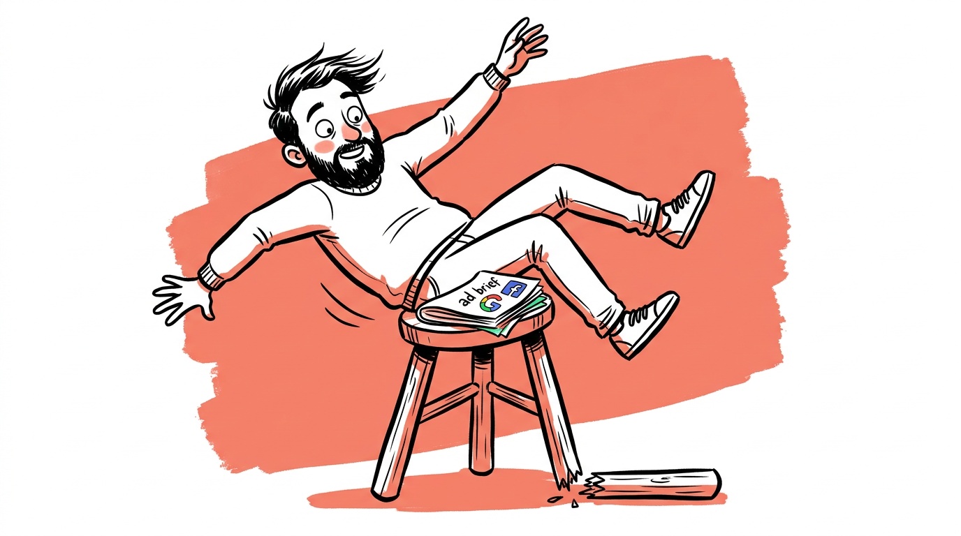

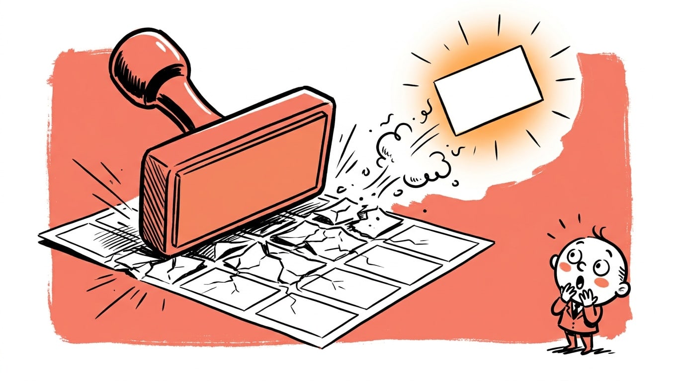
Most failing ads aren't missing a bigger budget. They're missing a structure. Strip away the ads that don't convert and you'll find the same three holes: the hook didn't earn attention, the claim didn't earn belief, or the call-to-action didn't earn the click. Fix all three and you have a high-converting ad. Miss any one and the other two do nothing.
That sounds obvious. It isn't. Most founders obsess over the visual style, the platform, or the audience targeting — and ship creative that structurally cannot convert regardless of how well it's placed.
TL;DR — Ad Creative Fundamentals
- Every high-converting ad needs exactly three components: a hook that stops the scroll, a value proof that earns belief, and a call-to-action that removes friction.
- A weak hook makes the rest of the ad invisible — most people never see past the first two seconds.
- "Value proof" is not a list of features. It's a specific, credible reason to believe the claim you just made.
- Polished ads are losing ground to creator-style and trust-based formats because audiences have learned to treat production value as an ad signal, not a quality signal.
- The three-component framework applies across Meta, Google, YouTube, and Reddit — the execution differs, but the structure doesn't.
Why Structure Beats Style Every Time
Advertising platforms are attention markets. You are not competing against bad ads — you are competing against everything else in a person's feed: their friend's wedding photos, a video they actually wanted to watch, a news story. The question your creative has to answer in under two seconds is: why should I stop here?
Style — color palette, font choice, production budget — is downstream of structure. A beautifully shot video that opens on a logo loses to a shaky phone video that opens on a painful problem the viewer has right now. The pattern holds consistently across the accounts we work with.
Structure means: hook → proof → action. In that order. Every time.
Element 1: The Hook (You Have Two Seconds)
The hook is not your brand name. It is not "introducing." It is the first thing that makes a stranger decide this content is worth one more second of their time.
Hooks that work share one of a few properties. They either state a problem so specifically that the right viewer feels personally named, or they make a claim surprising enough to create curiosity, or they show something unexpected before a word is spoken. The worst hooks do none of these — they open with brand imagery or a generic positive statement that could apply to any product in any category.
What a Strong Hook Actually Looks Like
Specificity is the variable that separates strong hooks from weak ones. "Tired of slow software?" is weak. "We cut our client's reporting time from four hours to eleven minutes" is strong. The second version does two things at once: it hooks with a specific claim and it begins the proof before the viewer even realizes the hook is over.
For video ads, the visual hook and the verbal hook need to work together. If your first frame is someone looking happy and your first line is a generic promise, you've used two channels to say nothing. If your first frame shows a broken spreadsheet and your first line is "this is why your Monday mornings are terrible," you've used two channels to say the same specific thing — and that redundancy is actually good.
For static ads, the hook is the headline or the dominant visual element. The same rules apply. Specificity beats cleverness. Problem-first beats solution-first in most categories.
How to audit your hook with a metric: On video, your platform's 3-second view rate (sometimes called thumbstop rate) tells you whether the hook is doing its job. A low 3-second view rate relative to impressions means people aren't pausing — the problem is the hook, not the rest of the ad. On static, a low click-through rate on an otherwise healthy account points to the same failure. Fix the hook before touching anything else. (What makes a great hook goes deeper on the six formats that reliably stop the scroll.)
Element 2: Value Proof (Belief Is the Bottleneck)
Most ads that get past the hook fail here. They make a claim — "the best CRM for small teams," "the coffee that changes everything" — and then offer nothing to support it. The viewer's implicit question is always: says who?
Value proof is the answer to that question. It doesn't have to be a case study or a wall of testimonials. It does have to be specific enough that a skeptical person can't dismiss it in a single thought.
The formats that work:
Specific numbers. Not "dramatically faster" — "forty-three seconds instead of twelve minutes." Specificity signals that you've actually measured something, which is more convincing than a superlative that any competitor could also claim. In our 13,572-ad study, 36.4% of good-rated headlines contained a digit against 17.9% of bad-rated ones.
Mechanism explanations. Telling someone why the thing works is often more convincing than telling them that it works. "We skip the middleman distributor" is more believable than "we're cheaper." The mechanism gives the claim a logical foundation.
Social proof with context. "5 stars" means nothing. "A CFO at a 30-person SaaS company told us she stopped using Excel entirely after the first week" is specific enough to be believable. The context is what makes it land.
Demonstrations. Showing the product working is proof. Screen recordings, before/after comparisons, and live use-cases bypass the skepticism that words alone trigger. This is one reason creator-style content is outperforming polished brand ads — a creator using your product on camera is a demonstration, not a claim.
How to audit your proof with a metric: A large gap between click-through rate and conversion rate usually points to a proof failure. People clicked — the hook worked — but they arrived on your landing page unconvinced. If your CTR is healthy and your conversion rate is low, the problem is almost always that the proof in the ad didn't transfer into belief before the click.
Polished ad formats are losing share to creator content, user-generated video, and founder-led ads. The underlying reason is structural: high production value used to signal quality. Now it primarily signals "this is an ad" — and audiences skip ads. Raw, specific, person-to-camera content reads as authentic because it looks like the content they chose to watch. The proof is embedded in the format itself.

Live today.
The full campaign — copy, images, targeting — generated for your site and deployed paused for your approval.
Element 3: The Call-to-Action (Remove Every Friction Point)
A call-to-action is not a button. It is an instruction that reduces the cognitive cost of the next step to near zero.
"Learn more" is not a call-to-action. It describes a vague outcome with no specificity about what happens next. "Start your free trial — no card required" tells someone exactly what they'll do, exactly what they'll get, and removes the specific objection (payment risk) that most free trials trigger.
The best CTAs do three things:
- Name the exact action. Click, book, download, start — concrete verbs.
- State the specific outcome. What does the person have or know immediately after they click?
- Address the most likely objection. "No card required," "cancel any time," "takes two minutes" — pick the one friction point most likely to stop your specific audience and neutralize it in the CTA itself.
How to audit your CTA with a metric: Look at your landing page's click-to-action rate — the share of people who arrive and take the intended next step. If that number is low and the page hasn't changed, the CTA in the ad is setting wrong expectations. People clicked expecting one thing and landed somewhere that felt different. Align the CTA copy to the exact first action on the landing page.
The mistake most founders make is treating the CTA as an afterthought — the last thing written, the last thing designed, the least time spent. It should be written first, because everything else in the ad exists to make that final action feel inevitable.
How the Three Elements Interact
These aren't independent checkboxes. They're a chain. A broken link anywhere breaks the whole thing.
A strong hook with weak proof trains your audience to click and then feel deceived — bad for conversion rates, worse for retargeting costs. Strong proof with a bad CTA means you've convinced someone who then has no clear path to act on the conviction. A great CTA on an ad nobody watched is invisible.
The sequencing matters too. You cannot lead with proof before you've earned enough attention for the viewer to care. You cannot CTA before they believe the claim. The order — hook, proof, action — mirrors the psychological sequence of a purchase decision: notice, evaluate, decide.
Our labeled ad corpus shows the same pattern consistently: ads that outperform do so across all three components together. The ones that underperform most often have a strong hook but thin proof — they generate clicks that don't convert, which is expensive in a different way than getting no clicks at all. Clicks cost money. Clicks that don't convert cost money twice.
Applying This Across Platforms
The structure is constant. The execution shifts.
On Meta, you're interrupting. The hook has to work visually in the first frame before any sound plays — many users scroll with sound off. Proof lives in the body copy or the video middle section. The CTA has to be visible without expanding the post. (Our Meta creative hooks, formats and testing guide covers the format side.)
On Google Search, the hook is the headline — it has to match the query closely enough to feel like an answer. Proof lives in the description lines and ad extensions. The CTA is often implied by the landing page destination rather than explicit ad copy.
On YouTube, you have a skippable format working against you. The hook must survive the skip button — meaning you have roughly five seconds before the viewer makes a choice. Proof has to come fast, often within the first fifteen seconds if you want it seen. The end-screen CTA is a known pattern; using it clearly still outperforms ignoring it.
On Reddit, the audience is allergic to obvious advertising. Reddit's own creative guidance acknowledges this — the hook needs to feel native to the conversation. Proof is disproportionately important here because Reddit users will surface weak claims in the comments, which affects delivery. The CTA should feel like a logical next step for someone already curious, not a pressure tactic.
The Most Common Way Founders Break This Framework
The single most common failure pattern: founders write ads that are accurate but not persuasive. The hook describes the product. The body lists the features. The CTA says "learn more." Everything in the ad is technically true. None of it converts.
The gap is between accuracy and persuasion. Accuracy means the claims are correct. Persuasion means the claims are felt as relevant and believable by someone who didn't wake up thinking about your product.
Fix: write the hook from the customer's problem, not your product's existence. Write the proof from the customer's skepticism, not your confidence. Write the CTA from the customer's next question, not your marketing checklist.
Your job is not to describe the product. It is to answer, in sequence: why does this matter to me right now, why should I believe it, and what exactly do I do next?
Product knowledge creates a specific curse: the closer you are to what you've built, the harder it is to write from the customer's starting point. The best diagnostic is to hand the ad to someone who has never heard of your product and ask them those three questions after two seconds. If they can't answer all three, you know exactly what's broken.
FAQ
What is the most important element of ad creative? The hook. If your ad doesn't stop someone in the first two seconds, they never see the proof or the CTA. A weak hook makes the rest of the creative irrelevant. Start there, and measure it with your platform's 3-second view rate or thumbstop rate before touching anything else.
What is "value proof" in an ad and how do I create it? Value proof is the specific, credible reason a skeptical viewer should believe the claim you just made. It can be a real number, a mechanism explanation, a specific customer story with context, or a live demonstration. Vague superlatives don't count. The more specific the proof, the more believable it is.
Why are traditional polished ads losing to creator-style content? High production value used to signal quality. Now it primarily signals "this is an ad," which triggers skip behavior in most audiences. Creator-style content — phone video, person-to-camera, unscripted — reads as authentic because it looks like the content viewers chose to watch. The format itself functions as proof of authenticity.
How should a call-to-action be written for a paid ad? Name the exact action (click, start, book), state the specific outcome the viewer gets immediately after, and address the most likely objection to taking that step. "Start your free trial — no card required" is a real CTA. "Learn more" is not.
Does this three-element framework work on Google Search ads as well as Meta? Yes, though the execution differs. On Search, the hook is the headline matched to the query. Proof lives in description lines and extensions. The CTA is often reinforced by the destination URL. The structure — hook, proof, action — holds across every format.
How do I know if my hook is strong enough? Test it against this question: if someone saw only the first frame (static) or first two seconds (video), would they know exactly what problem you're solving and feel that it might be relevant to them? If no, the hook needs to be more specific or more problem-focused. On video, a low 3-second view rate confirms the diagnosis.
Why do most founders write ads that don't convert even when they know their product well? Because product knowledge creates a curse of familiarity. Founders write from the inside — describing what the product is and does. Customers need to hear from the outside — what problem it solves, why they should believe it, what happens next. Knowing your product deeply makes it harder, not easier, to write from the customer's starting point.
Live today.
The full campaign — copy, images, targeting — generated for your site and deployed paused for your approval.
We build AdControlCenter — AI-powered ad management for small businesses, online stores, SaaS companies and service providers. We write what we'd want to read: real numbers, no fluff, the things we wish we'd known when we started.
More from the team →