This is ACC Ad Teardown #1 — a weekly series. We take one proven ad from the same corpus behind our 13,572-ad research report, slice it apart move by move, and then rebuild it with our own engine. No theory, no "10 tips" — one real ad that demonstrably works, and exactly why.
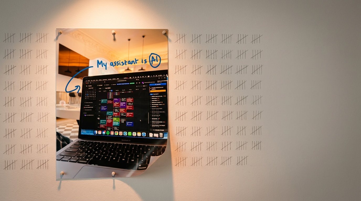
The median Facebook ad lives about 37 days. The ad below — a blurry photo of a laptop with a handwritten scribble over it — has been running for 776 days. In Meta terms, that's not an ad, that's a monument. Somebody at Motion (the AI calendar app) has been quietly letting this thing print for over two years while prettier creative around it died by the thousands.
Here's what makes it immortal, piece by piece — and then our rebuild.
- Motion's scribble ad has run 776 days on Meta (the screenshot inside it is from January 2024 — the ad outlived its own screenshot).
- Its anatomy is three moves: a handwritten hook, deliberately unpolished "mess," and the product caught doing its job rather than being demoed.
- It leaks in three places: it's brandless, the "25% more done" claim rides on vibes, and the scribble pattern has been strip-mined by imitators since 2024.
- We rebuilt it with ACC's Creative Lab: same formula, leaks patched. The circled word is now the brand, and the proof is legible at feed size.
- The transferable formula: one real photo + one handwritten sentence a friend would text + one arrow pointing at the proof.
The ad, untouched
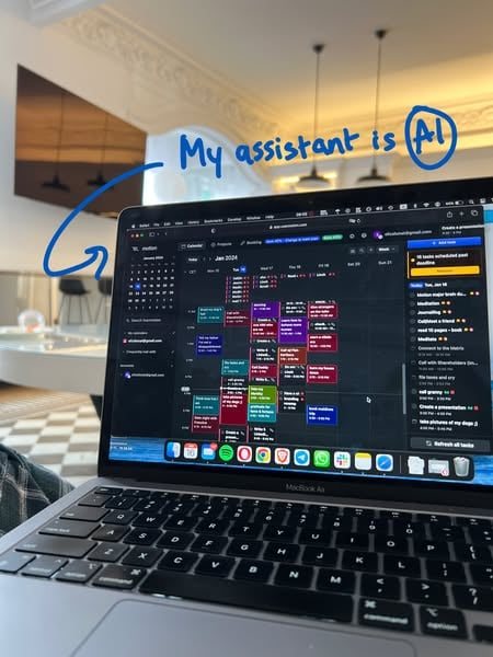
The whole ad: someone's apartment, someone's lap, one sentence in blue ink. See it running in Meta's Ad Library.
Motion is an AI calendar: it takes your task list and auto-schedules it into your week, reshuffling when things slip. This is how they've chosen to explain that on Meta for over two years. No studio shot, no gradient, no logo lockup. The paired copy, as served:
Headline: Get 25% more done Body: There's a new way to get 25% more done. · usemotion.com
Note the division of labor. The image never mentions a benefit, and the copy never tries to be charming. The creative does the feeling; the headline does the promise. Each half does one job.
Why it works: three moves
Move 1 — the scribble does the selling
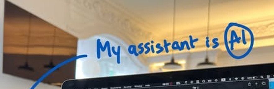
The hook. Handwritten, lowercase energy, one circled word. This is the entire ad — everything else is evidence.
Feeds are set in system fonts. Handwriting is the one typography no platform renders, so your brain files it as person, not brand — before you've read a word. Then the details go to work: the circle around "AI" is the emphasis a friend would add, and the arrow gives your eye a literal instruction — follow me down to the screen.
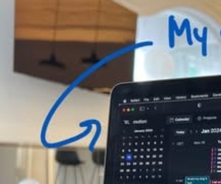
The arrow isn't decoration — it's eye-tracking you can draw. It converts a glance into a guided tour: note first, product second.
Move 2 — the mess is the craft
Look at what a brand team would have cleaned up: ornate crown molding and pendant lights in the background, a kitchen glowing behind the screen, a keyboard shot at a lazy angle from the sofa. Every "unprofessional" pixel is a credibility signal. Nothing here looks purchased, so your ad-blindness never triggers.
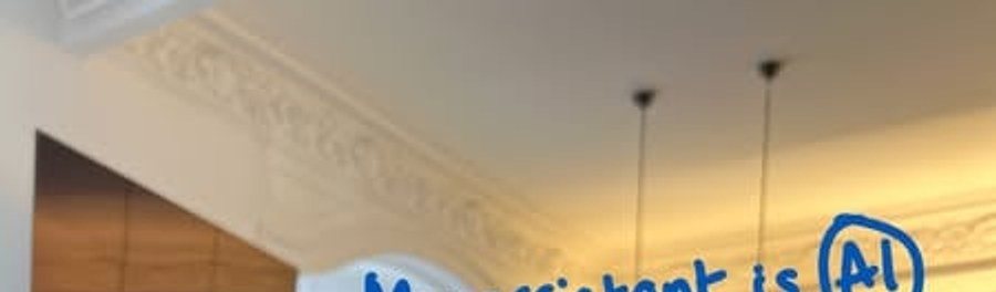
Not an office, not a set — someone's apartment at 08:58. The crown molding is doing more trust-building than most testimonial sections.

The tell-detail: a real dock. Spotify, Telegram, WhatsApp, a full trash bin. A brand screenshot would have hidden it — leaving it in is what makes the screen believable.
Move 3 — the product is caught in the act (and it's human)
The screen isn't a feature demo; it's surveillance of the product doing its job. A packed, color-blocked week reads as "busy but handled" at feed speed.
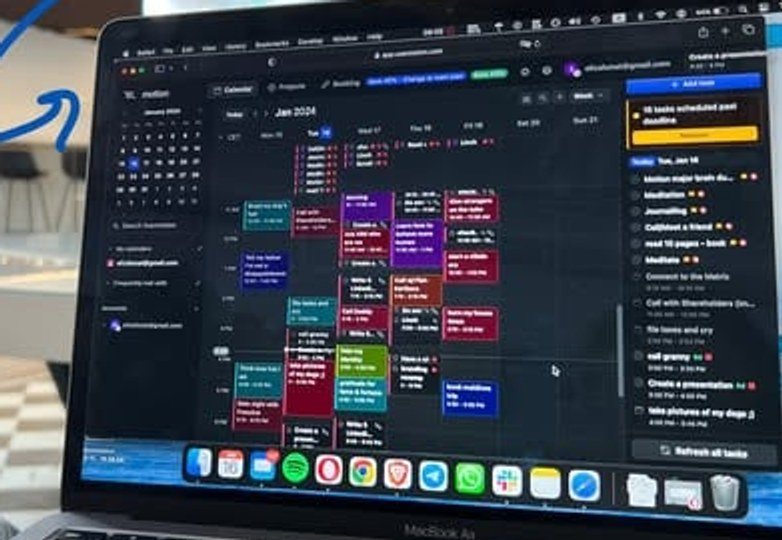
Busy-but-handled. You don't read this at feed speed — you feel it. (The screenshot is from January 2024. The ad outlived its own screenshot by two years.)
And if you lean in — Meta's audience did, for two years — the task list is a person, not a persona:
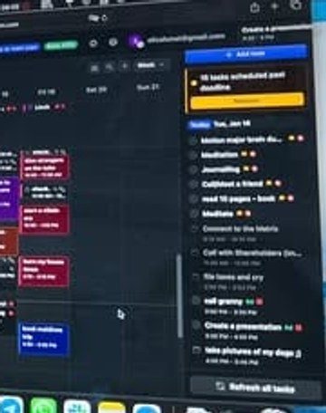
"File taxes and cry." "Call granny." "Take pictures of my dogs 🐶." And the smartest pixel in the ad: a yellow banner rescheduling 16 slipped tasks.
That yellow "16 tasks scheduled past deadline" banner demonstrates the core feature — Motion reshuffles what slips — without a single word of marketing claiming it. Shown, not told.
The transferable move: annotate, don't design
Strip the props and the formula travels to any product that has a visible "in use" state — SaaS, ecommerce, services:
The discipline is in what you leave out: no logo, no brand colors, no benefit copy on the image. The paired headline carries the promise so the creative doesn't have to.
Live today.
The full campaign — copy, images, targeting — generated for your site and deployed paused for your approval.
Where it leaks
Every teardown needs teeth. Three honest weaknesses:
- It's brandless. The only brand asset in the frame is an 8-pixel "motion" in the corner of the UI. This ad is optimized to be clicked, not remembered — if the landing page doesn't convert, nothing gets banked in memory for next time.
- The claim rides on vibes. "Get 25% more done" appears nowhere in the creative and is supported by nothing in it. The landing page has to carry the entire burden of proof alone.
- The formula is public domain now. Scribble-over-screenshot has been strip-mined since 2024. Day 776 proves it still works, but the pattern-interrupt decays as feeds fill with fake handwriting — and most imitators get the mess wrong by art-directing it, which defeats the entire mechanism.
The rebuild: keep what works, fix what leaks
A 776-day ad has earned the right not to be replaced. So we didn't ask our engine for a better idea — we asked it for this idea, minus the leaks. The rule for regenerating a proven ad: keep every move that made it work, and spend your changes only where it leaks.
Kept — the real-photo genre, the handwritten blue hook with one circled word, the arrow, the image/copy division of labor.
Fixed — three things:
- Brandless → branded. The circled word is now the brand: "My assistant is Motion." Every impression banks memory, even without the click.
- Illegible proof → visible proof. The arrow now lands on a readable "rescheduled" banner — the core promise, demonstrated at feed size.
- Vibes → behavior. Instead of an unsupported "25% more done," the ad shows the product doing its one job: replanning a slipped week.
We fed that into ACC's Creative Lab using the two controls every user has — "describe the ad you want" plus the fix-it feedback box. This is the actual directive, unedited, under the product's 400-character limit:
Candid iPhone photo, NOT a designed ad: real home scene, imperfect angle, natural light, slight clutter. The ONLY text: the headline handwritten in blue marker over the photo (circle the word Motion) plus a rough hand-drawn arrow pointing at the yellow 'rescheduled' banner on the laptop screen. No typeset text, no footer line, no logo, no clean graphics. Must look unproduced, like a photo a friend sent.
And this is what came back:
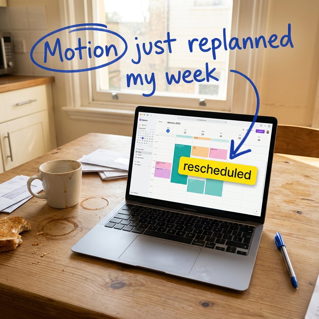
Same genre, same handwriting, same arrow — but the circled word is the brand, and the proof is legible from three feet away. The kitchen mess (bitten toast, coffee rings, a pile of bills) does exactly what the sofa blanket did in the original.
Two more takes from the same batch, including a near-shot-for-shot homage to the original's lap POV:
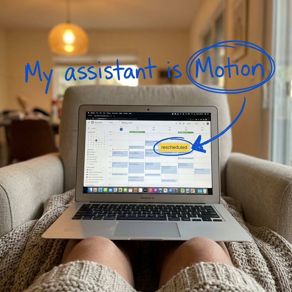
The homage: lap POV, blanket, pendant light — even the dock made it in.
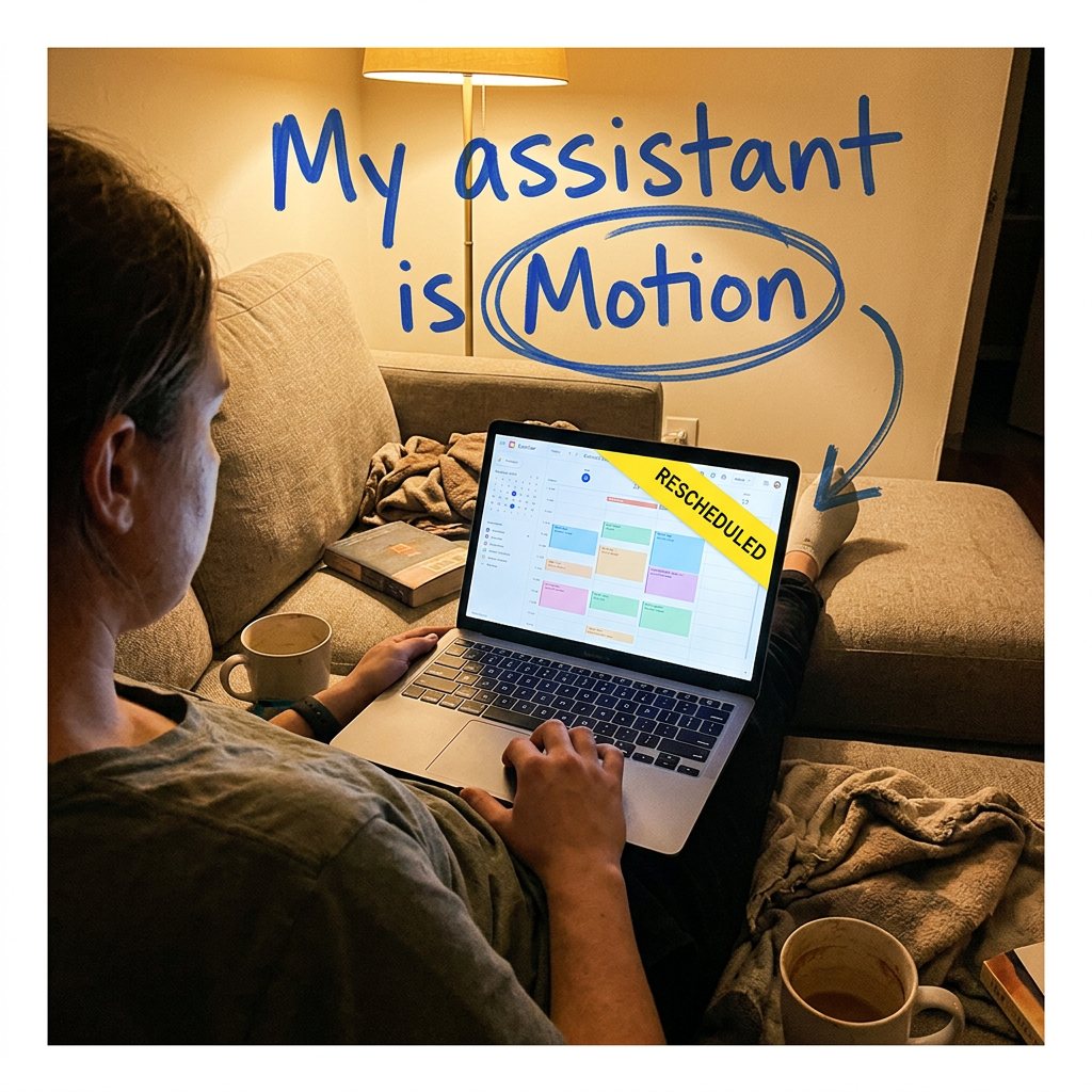
The evening take: socked feet, two mugs, over-the-shoulder. Same formula, different hour.
Full disclosure, because teardowns need teeth both ways: our "rescheduled" banner is typeset, not native UI — we traded a little rawness for a proof you can actually read in-feed. That's a bet, and Motion's 776 days say the rawer bet works too.
For the record: before we constrained it, we also ran the Lab with zero brief. Its best uncoached pick went a different genre entirely — "Asana. Notion. Cal. Slack. Tape." — yet still reached for handwriting as its authenticity device:
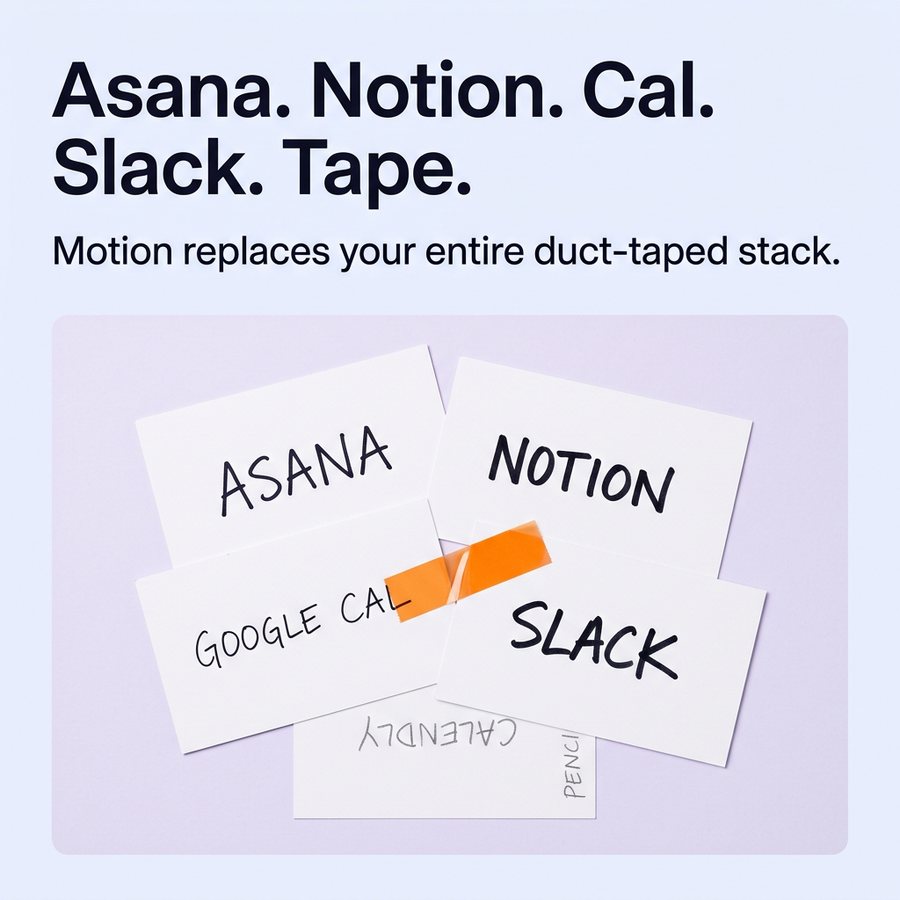
Same instinct, different argument. (Two of its seven finalists shipped with visible flaws — the selection screen exists for a reason.)
Verdict: steal the structure, not the scribble
What kept this ad alive for 776 days isn't handwriting. It's that every pixel is an authenticity signal, and all of them point at one promise. Copy the discipline, not the pen. (What makes that kind of opener work in general — the information gap — is in what makes a great hook for paid ads.)
Next teardown: another long-runner from the corpus. If there's an ad you want sliced apart — yours, or a competitor's — tell us.
Live today.
The full campaign — copy, images, targeting — generated for your site and deployed paused for your approval.
We build AdControlCenter — AI-powered ad management for small businesses, online stores, SaaS companies and service providers. We write what we'd want to read: real numbers, no fluff, the things we wish we'd known when we started.
More from the team →