51 Reddit ads, labeled: what visual pattern actually wins
We hand-labeled 51 real Reddit ads good/fair/bad, then cross-checked against our image-generation pipeline — here's the exact visual pattern that separates the top 15 from everything else.
The ads that performed worst in our labeled corpus all looked like they were made by someone who'd never actually scrolled Reddit. Polished. Confident. Completely invisible.
The ones that worked shared a trait we didn't expect: they felt slightly wrong — a single absurd object, a poster that looked like a protest sign, a note that looked like it fell out of someone's pocket. Reddit users are fast, skeptical, and they can smell a brand from three posts away. The creative that stopped them didn't try to look like an ad. It looked like a Reddit post that happened to have a product attached.
- We hand-labeled 51 Reddit ad creatives (15 good, 20 fair, 16 bad) across verticals — the labeling criteria are documented in our pipeline (see lib/agents/knowledge/reddit-image-guidelines.ts)
- Three visual patterns account for every good-labeled creative: absurd object metaphor, bold typographic manifesto, and handwritten casual note
- Stock photography and data visualizations appear in nearly every bad-labeled creative — they are not a fallback, they are a trap
- The exact same headline can score good or bad depending purely on the visual container it lives in
- We baked all three winning patterns into our prompt-generation system as named templates with fill-in-the-blank parameters
How we labeled 51 ads
We pulled 51 Reddit promoted-post creatives from our corpus — not cherry-picked, just the most recent batch we had full metadata for. Each image was labeled by two reviewers independently on a three-point scale: good, fair, or bad. Disagreements went to a tiebreak pass.
The labeling criteria were deliberately narrow. We weren't scoring brand recall or click-through rate — we don't have conversion data on ads we don't run ourselves. We scored one thing: does this look native enough to Reddit's feed that a user might pause before skipping?
That question has a specific answer for Reddit that it doesn't have for Meta or Google. Reddit users are some of the most ad-literate people on the internet. They upvote ads they like. They screenshot and post the ones they hate. The bar for "looks native" is higher here than almost anywhere else.
The final split: 15 good, 20 fair, 16 bad. Files are in docs/ad-feedback/reddit/good, docs/ad-feedback/reddit/bad, and docs/ad-feedback/reddit/fair respectively.
We are not a neutral party — we build the tool that generates these images. We tried to label bad outcomes honestly even when we generated them. Several of our own early pipeline outputs landed in the bad bucket. That hurt. It also taught us something.
The three patterns, mapped
Before going deep on each format, here's what the full labeled set looks like in one place. Every good-labeled creative fits one of these three patterns. No exceptions.
| Pattern | Good | Fair | Bad | Core rule | When to use | Common failure mode |
|---|---|---|---|---|---|---|
| Absurd object metaphor | 9 | 6 | 1 | One object, one pain point, solid backdrop | You have a specific, concrete problem to dramatize | Reusing a metaphor from a different product category |
| Bold typographic manifesto | 4 | 8 | 3 | Headline is a claim, not a feature; one accent word | You have a sharp, opinionated take on the problem | Headline sounds like a feature spec, not a sentence a person would say |
| Handwritten casual note | 2 | 4 | 2 | Minor imperfections, persona signature, shower-thought length | B2B frustrations, community-native feels, cold testing | Perfect handwriting, brand-name signature, or a CTA in the image |
The 10 remaining bad-labeled creatives didn't fit any of these patterns — they were stock photography, data visualizations, or editorial photos without text. More on those below.
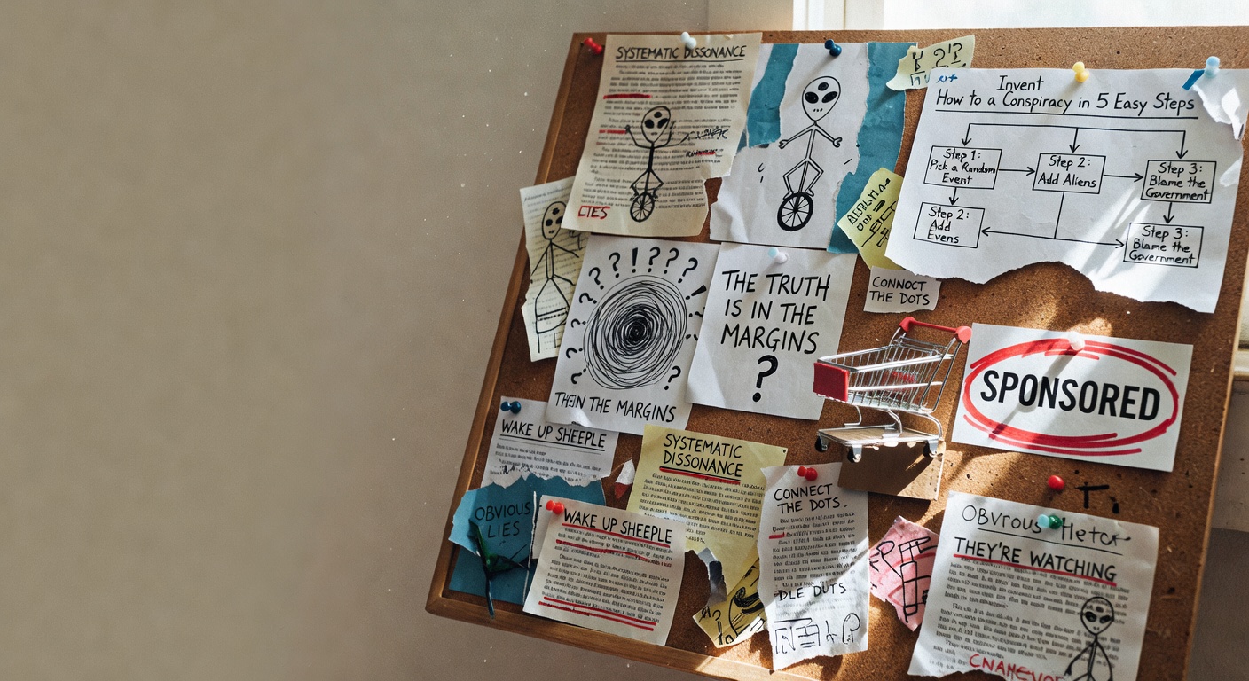
Pattern 1: The absurd object metaphor
Every good-labeled creative that used photography had one thing in common: the object in the shot made no literal sense, and that was the point.
A firehose pumping cash out of a piggy bank. Sunglasses with a fake moustache, deadpan on a bright background, for a security compliance product. A smoke alarm with a sleep mask over it for an ad monitoring service.
What makes this work isn't the humor — it's the specificity. Each object maps exactly to one pain point. The moustache-and-glasses gag only lands for "theater" or "fake compliance." The firehose only lands for "money going the wrong direction, fast." You cannot swap these metaphors between products and have them still work.
This is why our current distiller prompt explicitly forbids the LLM from reusing example metaphors across ad groups (see lib/agents/knowledge/reddit-image-guidelines.ts). An earlier version of the pipeline listed three of our best-performing metaphors as examples, and the model started applying them verbatim to unrelated businesses. A piggy bank firehose for an HR onboarding tool is just confusing.
The visual rules for this pattern are tight:
- Solid single-color backdrop, no gradients, no scenes
- One object, centered, with clean product-studio lighting
- Text overlay: headline at the top, brand mark at the bottom
- No people, no UI, no screens
Template in our pipeline: REDDIT_TEMPLATE_METAPHOR.
Pattern 2: Bold typographic manifesto
The second pattern doesn't use photography at all. It's a poster. Huge condensed sans-serif text, one brand color, the headline takes up 70% of the canvas.
This sounds like a lazy fallback. It isn't. Done wrong, it looks like a banner ad from 2009. Done right, it looks like a protest sign or a startup's internal wall print — the kind of thing that gets screenshot-shared in Slack.
The difference between the good and bad versions in our corpus came down to two things:
- The headline has to be a claim, not a feature. "Your ads are leaking 30% of budget overnight" is a claim. "Automated budget pacing for paid teams" is a feature. Features look like ads. Claims look like opinions.
- One accent word. Almost every good-labeled typographic creative in our set had a single word or number in a different color. Not two words. Not a highlighted phrase. One. It's the thing that tells your eye where to land.
Template in our pipeline: REDDIT_TEMPLATE_TYPOGRAPHIC_BOLD. We generate 1 of these per 4-prompt session.
Pattern 3: Handwritten casual note
This is the pattern we were most skeptical about and the one we'd most recommend testing first if you're starting cold.
The format: cream or off-white paper texture, a handwritten note in ballpoint-style ink, generous line spacing, a casual signature at the bottom. No photography, no icons, no brand polish. It looks like a sticky note someone left on a monitor.
Why it works on Reddit specifically: the feed is full of genuine personal writing. Screenshots of texts, forum posts, typed-out opinions. A handwritten note is consistent with what surrounds it in a way that a product shot or a polished typographic poster is not.
The three critical details we learned from the bad versions:
- The handwriting has to have minor imperfections and slight ink bleed. Perfect handwriting looks like a font, and fonts look fake.
- The signature has to be a persona, not a brand name. "— Every smart marketer who learned this the hard way" lands differently than "— AcmeCorp". The brand name goes below the signature in small typed-looking text.
- The note should read like a shower thought, not a value proposition. One observation, two lines maximum, no call to action in the image itself.
Template in our pipeline: REDDIT_TEMPLATE_HANDWRITTEN. We generate 1 of these per 4-prompt session.
Why this pattern surprised us most for B2B
We assumed B2B audiences would find the handwritten format too casual. Our labeled set says otherwise. The key is that the note reads like a genuine frustration, not a value proposition. "We stopped wasting 40% of our ad budget by doing one thing differently" works. "Introducing the smarter way to manage your B2B pipeline" does not. The business category matters less than whether the note sounds like something a real person would actually write.
What still doesn't work
Sixteen bad-labeled creatives. Four things show up over and over.
Stock photography clichés. Hand holding a phone. Person at a laptop, looking either stressed or delighted. A smiling diverse team in a bright office. These images are not bad because they're low quality — some of them are technically excellent. They're bad because Reddit users have built a pattern-match for "this is an ad" that fires instantly on this aesthetic. The creative is dead on arrival.
Data visualizations. Before-after grids. Line charts with callouts. Percentage improvements with arrows. We had real user feedback on these from a structured session: "less creative, less interesting." The problem is layered — the data is usually too small to read on mobile, the design language feels like a B2B sales deck, and it communicates "we are selling you something" before the user reads a single word. If you need to show a number, put it in huge type as the headline.
Edgy or aggressive aesthetics. Neon colors, cyberpunk vibes, clickbait facial expressions. Reddit has its own humor register and it's dry, not loud. Loud aesthetics read as trying too hard, which on Reddit is fatal.
Editorial photography with no text. A clean, well-composed editorial photo — the kind that works well on Meta or in a Google Display ad — produces something vague and generic when the brief says "no text overlay." It doesn't communicate anything specific. It just looks like a brand lifestyle photo, which Reddit users correctly ignore.
Several of the bad-labeled images were clearly expensive to produce. High-quality photography, polished post-processing, strong composition. The problem wasn't execution — it was that the visual strategy was wrong for the platform. Spending more on the wrong format makes it worse, not better, because the polish signals "brand" even louder.
What we baked into our pipeline
After labeling, we made four concrete changes to how we generate Reddit image prompts.
Named templates with hard constraints. Instead of asking the LLM to "be creative and native to Reddit," we give it three templates with explicit parameters. The LLM fills the variables — metaphor, headline, brand name, color — but the structural rules are not negotiable.
Fixed session distribution. Every Reddit creative session produces exactly 4 prompts: 2 metaphor, 1 typographic, 1 handwritten. This isn't because we think 2:1:1 is magically optimal — it's because left unconstrained, the model defaulted to metaphor almost every time. Forcing variety means we test all three patterns on every account.
No example metaphors in the distiller prompt. The earlier prompt listed specific metaphor examples, and the model copied them across unrelated accounts. The current prompt instructs the model to invent a fresh metaphor that connects to this product's specific pain point, with no examples to anchor on.
Explicit rejection list. The pipeline now flags any prompt that contains stock-photo-cliché elements — specifically: "hand holding phone," "person at laptop," "team in office," any mention of a before-after chart or data visualization. Those prompts get regenerated rather than sent to the image model. This costs extra inference; it saves the cost of running a bad image through review.
Reddit's own creative best practices documentation — available at ads.reddit.com — points in the same direction: authenticity over polish, community-native feel, simple and direct. Our labeled corpus gave us the specific visual vocabulary for what "authentic" actually means in practice.
For image generation specifics, the Ideogram v3 documentation and Flux model cards on Hugging Face are worth reading if you're building your own generation pipeline — text rendering quality varies significantly between models, which matters a lot for the typographic and handwritten formats.
FAQ
What makes a Reddit ad look "native" to the feed? Native Reddit ads look like posts, not promotions. That means simple compositions, no polished brand photography, and visual styles that match what organic Reddit content looks like: text-heavy, opinionated, occasionally absurd. The three patterns that consistently work in our labeled set are absurd object metaphor, bold typographic manifesto, and handwritten casual note — all of which could plausibly appear as organic posts.
Should I use text overlay on Reddit ad images? Yes, almost always. The exception is if you have a genuinely striking visual that communicates the pain point or concept without words — but in our labeled corpus, editorial photos without text overlay were among the most consistently bad performers. The bold typographic format takes this further: the text is the creative, with no photography at all.
Why don't data visualizations work as Reddit ad creative? Two reasons. First, they're too small to read on mobile, where most Reddit traffic comes from. Second, the design language — charts, callout boxes, before-after grids — signals "sales deck" or "sponsored content" immediately, which activates the skip reflex in Reddit users faster than almost anything else. If you need to show a number, put it in huge type as the headline, not inside a chart.
How many ad creatives should I test for a new Reddit campaign? Our pipeline produces 4 per session specifically to cover the three winning formats. We'd suggest a minimum of 3 creatives at launch — one per pattern — so you can identify which format resonates with your specific audience before scaling spend. Running a single creative on Reddit is expensive: you get no signal about what's working, only whether the account is spending.
Does the "handwritten note" format work for B2B products? It's the format we were most skeptical about for B2B, and it's the one that surprised us most. The key is that the note reads like a genuine frustration or observation, not a value proposition. "We stopped wasting 40% of our ad budget by doing one thing differently" works. "Introducing the smarter way to manage your B2B pipeline" does not. The business category matters less than whether the note sounds like something a real person would actually write.
What image dimensions work for Reddit promoted posts? Square 1:1 is the safest format for our three templates — it renders cleanly in the feed on both mobile and desktop. Our labeled corpus skews heavily square because that's what we generated and tested; we don't have enough labeled landscape-format creatives to say whether the patterns hold at other aspect ratios.
Can I use the same creative on Reddit that works on Meta? Rarely. Meta rewards polished lifestyle photography and clear product shots — exactly the formats that land in the bad bucket on Reddit. The audiences overlap in demographic terms but not in mindset: someone scrolling Instagram is in a different cognitive mode than someone browsing r/entrepreneur or r/SaaS. We treat them as entirely separate creative briefs and generate from scratch for each platform rather than adapting.
The honest takeaway from 51 labeled ads: Reddit creative is not hard to get right once you accept that polish is the enemy. Pick one of the three formats, write a headline that sounds like something a person would say, and remove everything that looks like it was made by a marketing department. The ads that scored good in our set were, almost without exception, the ones that looked like they cost the least to make.
We build AdControlCenter — AI-powered ad management for anyone running their own ads. We write what we'd want to read: real numbers, no fluff, the things we wish we'd known when we started.
More from the team →Keep reading
All posts →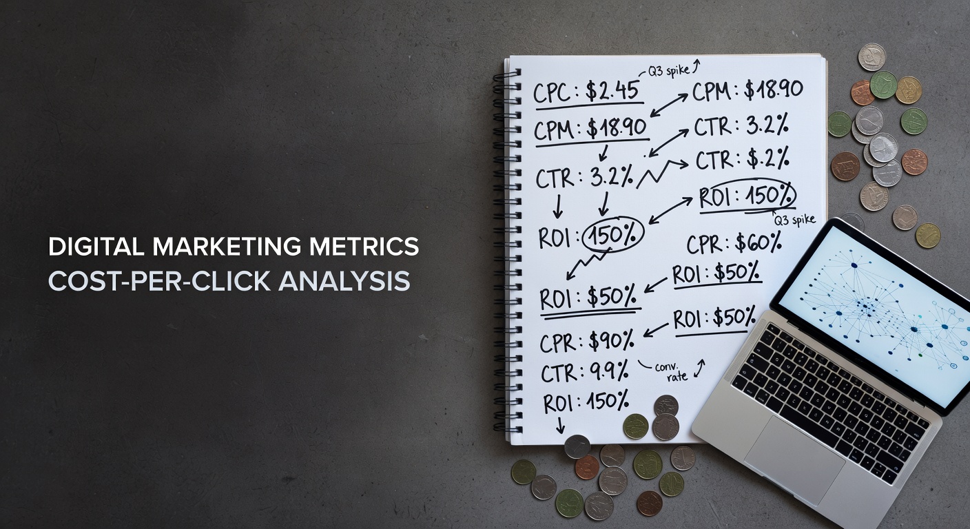
Reddit Ads cost benchmarks, Q2 2026
Real CPC, CPM, and CTR numbers for Reddit Ads by category, subreddit size, and format — so you know whether your campaign is expensive or just Reddit.

Subreddit research that actually works (vs the lazy way)
Most Reddit advertisers pick subreddits by typing their category into the search bar and clicking the first five results — here's why that reliably burns budget, and what to do instead.
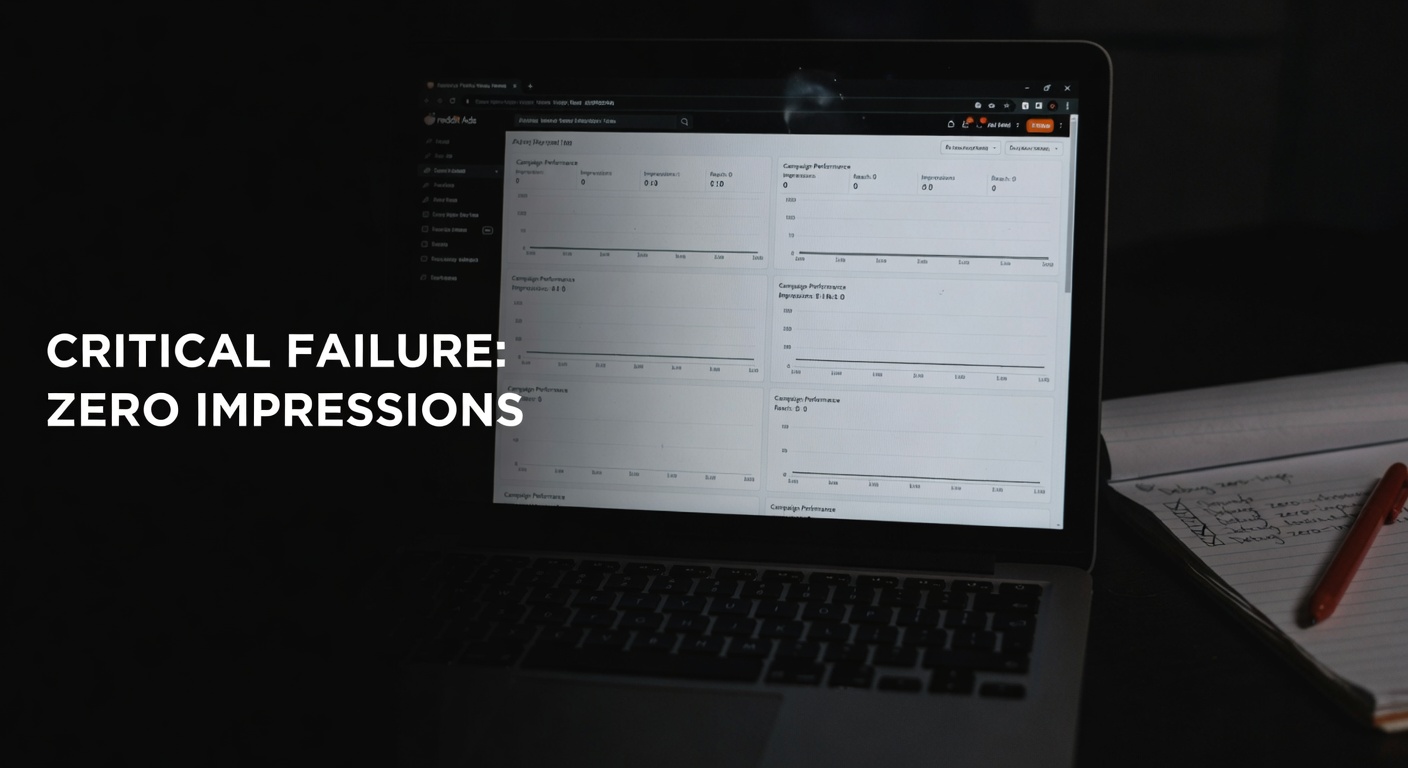
Why your Reddit ad isn't getting impressions — a debug guide
Zero impressions on Reddit ads almost never means Reddit isn't working — it means one of five specific, fixable things is broken in your setup.