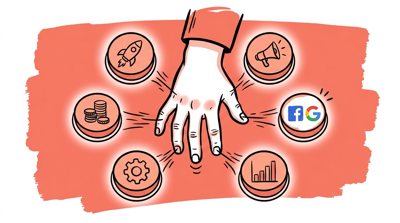
The fastest way to add invisible CTAs to a landing page is to leave the full site navigation in place. Most teams never think of the nav as a CTA problem. It is.
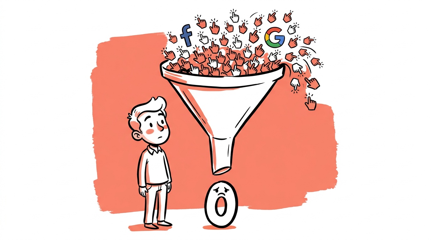
That's one piece of a larger pattern we see when we audit accounts where cost-per-conversion has crept up over quarters without an obvious cause. The landing page presents visitors with too many simultaneous choices: Book a demo. Start a free trial. Download the guide. Watch the video. Subscribe to the newsletter. Each one felt like a good idea when someone added it. Together, they produce paralysis. The user does nothing, clicks back, and your campaign eats the cost.
TL;DR — What This Post Answers
- Having multiple CTAs on a single page typically reduces total conversions, not increases them, because it triggers decision paralysis.
- Google's search intent framework — know, go, do, buy — gives you a direct map for which single CTA belongs at each funnel stage.
- The right CTA for a cold awareness visitor is almost never "buy now," and using it anyway wastes spend on people who aren't ready.
- Page clarity is not an aesthetic preference; it is a conversion variable you can test and measure.
- The fix is usually subtraction, not addition: remove CTAs until one remains per page, then align that one to the user's intent at that moment.
The Paradox of Choice Is Real, and It's Eating Your Ad Budget
Barry Schwartz popularized the idea in The Paradox of Choice — that more options reliably produce less satisfaction and less action. The finding has been replicated in purchase behavior research repeatedly, including the jam study from Columbia Business School, where a display with fewer options produced dramatically higher purchase rates than one with many.
Advertisers intellectually accept this for product catalogs but systematically ignore it for their own pages. The reasoning is usually something like: "Different visitors want different things, so we should offer everything." That logic sounds inclusive. What it actually does is offload the work of deciding onto the visitor — which is exactly the work they don't want to do. They came to your page because an ad told them one specific thing was waiting for them. When they arrive and find five different invitations, the implicit message is: we don't know what you need either.
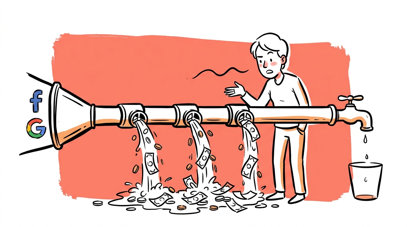
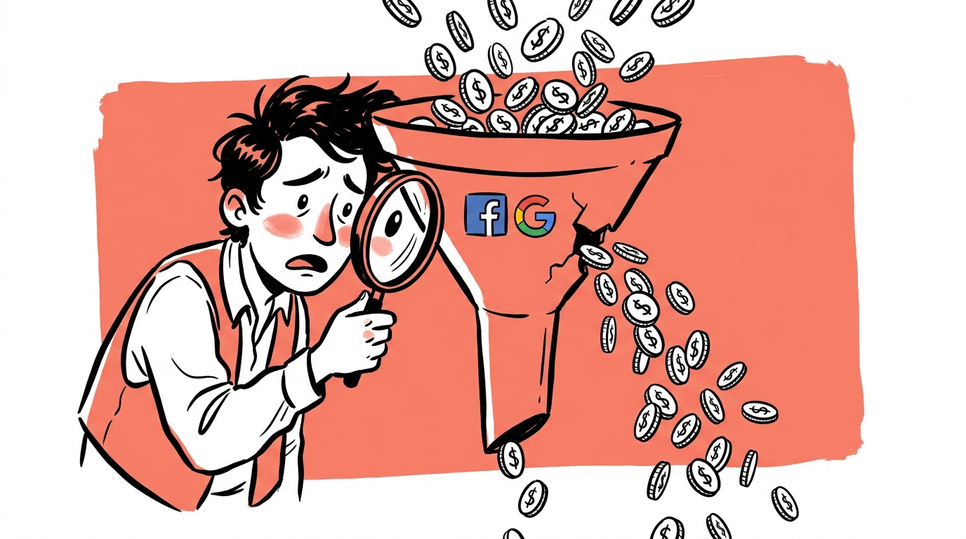
The cost is real. Every click you bought that ends in a bounce because the page was confusing is money spent on someone else's indecision. That's an expensive way to run experiments.
Google Told You the Answer a Decade Ago
Google's search intent taxonomy — know, go, do, buy — has been public for years. The short version: every query a person types (or every ad they click) reflects one of four underlying intentions.
- Know: I want to understand something.
- Go: I want to navigate to a specific place or brand.
- Do: I want to accomplish a task.
- Buy: I want to make a purchase.
The reason this matters for CTAs is mechanical. If someone clicked a top-of-funnel awareness ad because they're in a "know" state — they're researching, they don't have a problem definition yet, let alone a vendor shortlist — then a "Start Free Trial" CTA is not bold or ambitious. It's misaligned. It asks for a commitment the visitor hasn't reached yet. The page and the user are simply at different points in the conversation.
When your CTA doesn't match where the visitor actually is in their decision process, you pay for the click and get none of the conversion. Intent mismatch isn't a soft UX concern — it shows up as wasted spend in your campaign data.
The fix isn't to add a softer CTA alongside the aggressive one. That brings you back to the multiple-choice problem. The fix is to build separate pages — or at minimum separate ad sets pointing to separate pages — where each page has exactly one CTA aligned to exactly one intent stage.
What "One CTA" Actually Means
One CTA doesn't mean one button color or one link. It means one primary action you want the visitor to take. Everything else on the page — copy, images, testimonials, FAQs — should serve that one action, not compete with it.
A secondary link to your privacy policy is fine. A secondary link to your pricing page, your team page, your blog, and your demo booking form all in the nav is not fine — not on a paid traffic landing page. Each one of those is an escape hatch. Some visitors will take them because they're genuinely curious. Most will take them because the page gave them permission to defer the decision.
The Navigation Trap
When we review paid landing pages in accounts we audit, full site navigation is one of the most common structural problems we find. The nav is never added with the intent of hurting conversions. It's left there out of habit, or because removing it felt like hiding something from visitors.
What it actually does is give visitors a set of additional actions they could take instead of the one you want. Removing or collapsing the nav on paid landing pages is one of the higher-probability, lower-effort tests you can run. It doesn't make the page feel pushy — it makes it feel clear. Those are different things, and visitors respond to the difference.

Live today.
The full campaign — copy, images, targeting — generated for your site and deployed paused for your approval.
Matching CTA to Funnel Stage: A Practical Map
Here's how to think about CTA selection when you're building or auditing a campaign:
Know stage — The visitor is in research mode. They've clicked an ad that promised information or education. The right CTA here is something that extends the information relationship without demanding commitment: download a guide, read the full report, watch the explainer. Asking for a purchase here burns trust.
Go stage — The visitor knows your brand and navigated intentionally. They're evaluating. The CTA can be warmer: compare plans, see a live demo, start a free trial. They've self-selected into consideration.
Do stage — The visitor wants to accomplish something specific — they're using a tool, completing a task, solving an immediate problem. The CTA should reduce friction on that task. If it's a calculator or a template, give them the output. The CTA is often just "get result" or "use this."
Buy stage — The visitor is ready to exchange money for the thing. This is where "buy now," "get started," or "subscribe" is appropriate. Not before.
How to Audit Your Current CTA Situation
If you want to find out whether CTA overload is costing you, the diagnostic is simple and takes less than an hour.
Pull your five highest-spend landing pages. For each one, write down every distinct action a visitor could take — every link, every button, every form, every pop-up trigger. Count them. If the number is above three, you have a problem worth testing a fix for.
Then look at your bounce rate and time-on-page for paid traffic specifically (segment out organic, because organic visitors are often in a different intent state). If bounce rate is high and time-on-page is short, visitors are deciding quickly that this page isn't for them — which often means the page didn't match the promise of the ad, or the page was too complicated to parse quickly.
A Simple Test Structure
The test is straightforward. Strip the page to one CTA, make sure that CTA matches the intent implied by the ad, and run traffic against the original until you have a meaningful sample. Here's what to track:
- Primary metric: conversion rate on the target action (not blended across all clicks)
- Secondary metric: bounce rate on paid traffic segments only
- Minimum duration: enough sessions to reach statistical significance — most A/B testing calculators will tell you the threshold for your baseline conversion rate
What you're looking for is whether removing optionality moves the needle on the one action you actually care about. In most cases we've reviewed, the simpler version performs better. It doesn't always. But it's a cheap test with a high enough hit rate to run first before anything else.
Why Teams Keep Adding CTAs Anyway
The behavioral reason is worth naming, because it's not stupidity. It's anxiety.
Marketing and growth teams feel accountable for multiple metrics simultaneously. The demand gen team wants email captures. The sales team wants demo bookings. The product team wants trial signups. Each stakeholder looks at the landing page and sees an opportunity to get their number. The result is a page that tries to serve everyone and ends up serving no one.
When a landing page has six CTAs, it usually means six stakeholders had input and nobody had final say. The design team can't fix that — only a clear decision about what this campaign is actually trying to accomplish can.
The discipline required is organizational, not just tactical. Someone has to be willing to say: for this campaign, to this audience, we are optimizing for exactly one outcome. Everything else is secondary. That conversation is harder than it sounds when multiple teams have competing goals.
The One-Sentence CTA Test
Before you finalize any page or ad, run this test: complete the sentence, "I want the visitor to _____ right now."
If you can't complete it with a single verb and object — "book a demo," "start a trial," "download the report" — you don't have a clear enough intent to build the page yet. If you complete it with two things connected by "or," you have two pages, not one.
This sounds reductive. Apply it to your last five campaigns and see how many of them pass.
FAQ
What is page clarity in advertising? Page clarity refers to how quickly and easily a visitor can understand what a page is asking them to do. A high-clarity page has one clear message, one obvious next action, and no competing elements pulling attention elsewhere. In paid advertising, page clarity directly affects whether the click you bought converts or bounces.
How many CTAs should a landing page have? One primary CTA per landing page. Secondary elements like nav links or related content can exist on organic pages, but for paid traffic specifically, every additional action you offer beyond one reduces the probability that visitors take the action you actually want.
What is the Google search intent framework? Google's search intent taxonomy categorizes queries into four types: know (seeking information), go (navigating to a destination), do (completing a task), and buy (making a purchase). It's a useful map for deciding which CTA is appropriate at each stage of your funnel, because mismatching the CTA to the visitor's intent stage is a common and expensive conversion killer.
Does removing navigation from landing pages actually improve conversion rates? In many tested cases, yes. Full site navigation gives paid traffic visitors many paths away from the conversion action you want. Removing or simplifying nav on paid landing pages is one of the higher-probability, lower-effort tests you can run — particularly if your current bounce rate on paid traffic is high. It's worth running as a formal A/B test rather than assuming either direction.
Why do visitors leave a page without converting even when the offer is good? Most often, either the page didn't match what the ad promised (a trust problem), or the page presented too many options and the visitor deferred the decision (a clarity problem). Both show up as bounces and wasted spend. Good offers fail on bad pages constantly.
How do I know which CTA to use at which funnel stage? Map your ad audience's intent to the know/go/do/buy framework. Cold audiences who've never heard of you are almost always in "know" mode. Retargeted audiences who've visited your pricing page are likely in "buy" or late "go" mode. Build separate landing pages for each, and pick the one CTA that moves someone from their current stage to the next one — not three stages ahead.
What's the fastest way to test whether too many CTAs are hurting me? Pull your highest-spend landing pages, count every distinct action a visitor could take, and strip the top-spending page down to one CTA aligned to the ad's implied intent. Run it against the original for enough sessions to reach statistical significance. The result will tell you more than any audit report.
The uncomfortable truth is that adding CTAs feels productive and removing them feels like giving something up. It's the opposite. Every CTA you remove from a paid landing page is a decision you're making for the visitor — and that's exactly the work your conversion rate depends on you doing.
Live today.
The full campaign — copy, images, targeting — generated for your site and deployed paused for your approval.
We build AdControlCenter — AI-powered ad management for small businesses, online stores, SaaS companies and service providers. We write what we'd want to read: real numbers, no fluff, the things we wish we'd known when we started.
More from the team →