9 ways to multiply one product image into a full ad set
One product photo is enough raw material for a complete, platform-ready ad set — here are the exact nine templates we use to get there.
Most founders shoot one clean product photo and call it creative. Then they wonder why their frequency climbs and their ROAS falls. The photo was never the problem — the lack of variation was.
A single well-lit product image contains enough raw material to build a full ad set across Meta, TikTok, Google PMax, and Pinterest without touching a camera again. The constraint isn't the asset. It's knowing which nine transformations to run on it.
TL;DR — 9 ways to multiply one product image into a full ad set
- One product image can generate at minimum nine distinct creative variants by changing frame, context, copy layer, social proof element, and format — not the image itself.
- The nine templates map to distinct buyer psychology states: problem-aware, solution-aware, objection-heavy, social-proof-driven, and price-sensitive.
- AI generation handles background swaps and lifestyle context in minutes; the creative strategy behind the templates is what most tools skip.
- Each template has a recommended platform because creative-format fit affects quality score and delivery cost, not just aesthetics.
- A worked example below shows the exact same base image transformed nine ways, with the precise creative decision made at each step.
The false economy of shooting one shot
When we looked at ad accounts that were burning budget on creative fatigue, the pattern was consistent: a single hero image running in three to five ad sets, tweaked only by copy. Same visual. Same composition. Same background. The algorithm reads that as one creative no matter what the ad ID says.
Creative fatigue registers in frequency and relevance signals well before most founders notice it in ROAS. The fix people reach for is usually more spend. The actual fix is more visual variation — and the cheapest way to get it is to exhaust what you already own before going back to production.
That is what these nine templates do.
The 9 templates we ship
These are the exact nine transformation types we built into our creative workflow. They are ordered from lowest production effort to highest.
1. Clean white / transparent cutout Strip the background to white or transparent. This is the base layer everything else is built from. Google Shopping and PMax reward clarity over mood — a clean cutout on white is the correct default for those placements, not a creative shortcut.
2. Lifestyle background swap Take the cutout and drop it into a generated or stock background that matches the product's use context. A skincare serum gets a marble bathroom counter. A camping lantern gets a tent interior at dusk. The product is identical; the buyer's mental model shifts completely. AI generation tools handle this step fast — more on exactly which tools and where they break down below.
3. Feature callout overlay Keep the product image, add annotation arrows or callout pills pointing to specific product features with tight copy. "Ceramic-coated" with an arrow to the pan surface. "48-hr hold" with a bracket around the clasp. This template targets solution-aware buyers who are already comparing options and need a reason to stop scrolling.
4. Before / after split frame Place the product on one side, the result on the other. If you sell a supplement, one side is the product, the other is the outcome metric ("12 weeks. 14 lbs"). If you sell a SaaS tool, one side is the messy spreadsheet, the other is your dashboard. The contrast does the cognitive work. This is one of the strongest cold-traffic formats we run, because it externalizes the claim — the frame makes the argument, not the headline.
5. UGC-style quote card Place the product image small in a corner or edge. Give most of the frame to a pull quote from a real review in handwritten-style or large serif type. "I've tried six of these. This one actually works." The product becomes the attribution anchor, not the hero. Like the before/after, this format works cold because someone other than the brand is doing the asserting.
6. Problem-first frame Remove or minimize the product entirely from the primary visual. Lead with an image or illustrated representation of the pain state. The product appears smaller, at the bottom, with a line like "there's a fix." This template exists for cold audiences who don't know they're in-market yet. The product image appears as the resolution, not the lead.
7. Countdown / urgency frame Product image stays prominent. The surrounding frame adds a countdown badge, limited-quantity indicator, or sale-end date. This is not about being salesy — it's about giving the retargeting audience the marginal reason to act that they've been waiting for. This template belongs almost exclusively in warm or hot retargeting. Running it cold wastes impression cost and attracts low-intent clicks.
8. Comparison chart The product image anchors the top of a three-column comparison table: your product vs. generic alternative vs. competitor category. Check marks and X marks. Keep it to five rows. This template is expensive to build once and nearly free to iterate on because only the copy cells change. It performs in search-adjacent placements where buyers are actively comparing.
9. Platform-native format crop Take every variant above and re-crop it for each platform's primary placement: 1:1 for Meta feed, 9:16 for Stories and TikTok, 1.91:1 for Google Display, 2:3 for Pinterest. This is not a creative variant — it is a delivery variant. But skipping it is one of the most expensive mistakes in the list: a 1:1 creative running in a 9:16 placement surrenders the majority of its screen real estate to letterboxing, and platform delivery algorithms penalize poor format fit in quality scoring.
Template spec sheet
Use this as a production checklist. Each row lists the required elements, three example copy directions, and the platform compliance pitfalls most likely to get the variant rejected or under-delivered.
| Template | Required elements | Example copy directions | Compliance pitfalls |
|---|---|---|---|
| Clean cutout | White/transparent bg, full product visible, no text | — | Google Shopping: no watermarks, no promotional text overlaid |
| Lifestyle swap | Product to scale, bg matches use context, brand or product name optional | "Works where you work." / "Your counter, upgraded." / "Built for this." | Meta: generated backgrounds flagged if they imply medical settings (skincare, supplements) |
| Feature callout | 2–4 annotation elements, tight label copy (<4 words each), arrows or brackets | "Triple-wall vacuum." / "Leak-proof lid." / "Fits standard cup holders." | Text-heavy creatives penalized in Meta auction; keep text area under 20% of frame |
| Before / after | Clear left/right split, both sides legible at mobile scale | "Still using this?" / "12 weeks. 14 lbs." / "Then vs. now." | Before/after forbidden for weight loss and cosmetic surgery claims on Meta; check vertical-specific policy |
| UGC quote card | Real review text, product image ≤25% of frame, reviewer attribution optional | Pull actual review language verbatim | Fabricated reviews violate Meta and FTC policy; use real text only |
| Problem-first | Pain-state image dominant, product small at bottom, single CTA line | "No more rings." / "Still lukewarm at 2pm?" / "There's a fix." | Avoid imagery that could read as shocking or distressing under Meta's ad policies |
| Urgency frame | Product prominent, date or quantity badge, no fake scarcity | "Sale ends Sunday." / "47 left." / "Restocking in 6 days." | Countdown timers that reset are a policy violation on Meta and an FTC issue in the US |
| Comparison chart | 3 columns, 4–5 rows, product column wins majority | Column headers: product name / "Generic" / "Leading brand" | Competitor naming requires factual accuracy; false superiority claims invite trademark complaints |
| Platform crop | Correct ratio per placement, safe zone respected, no key elements cropped | — | Instagram Stories: keep primary content out of top 14% and bottom 20% of frame |
When to use each
Not every template runs in every campaign. Here is the rough mapping:
| Template | Funnel stage | Primary platform |
|---|---|---|
| Clean cutout | Any | Google Shopping, PMax |
| Lifestyle swap | Cold | Meta, Pinterest |
| Feature callout | Mid | Meta, LinkedIn |
| Before / after | Cold–Mid | Meta, TikTok |
| UGC quote card | Cold–Mid | Meta, TikTok |
| Problem-first | Cold | Meta |
| Urgency frame | Hot / retargeting | Meta, Google Display |
| Comparison chart | Mid | Meta, Google Display |
| Platform crop | All | All |
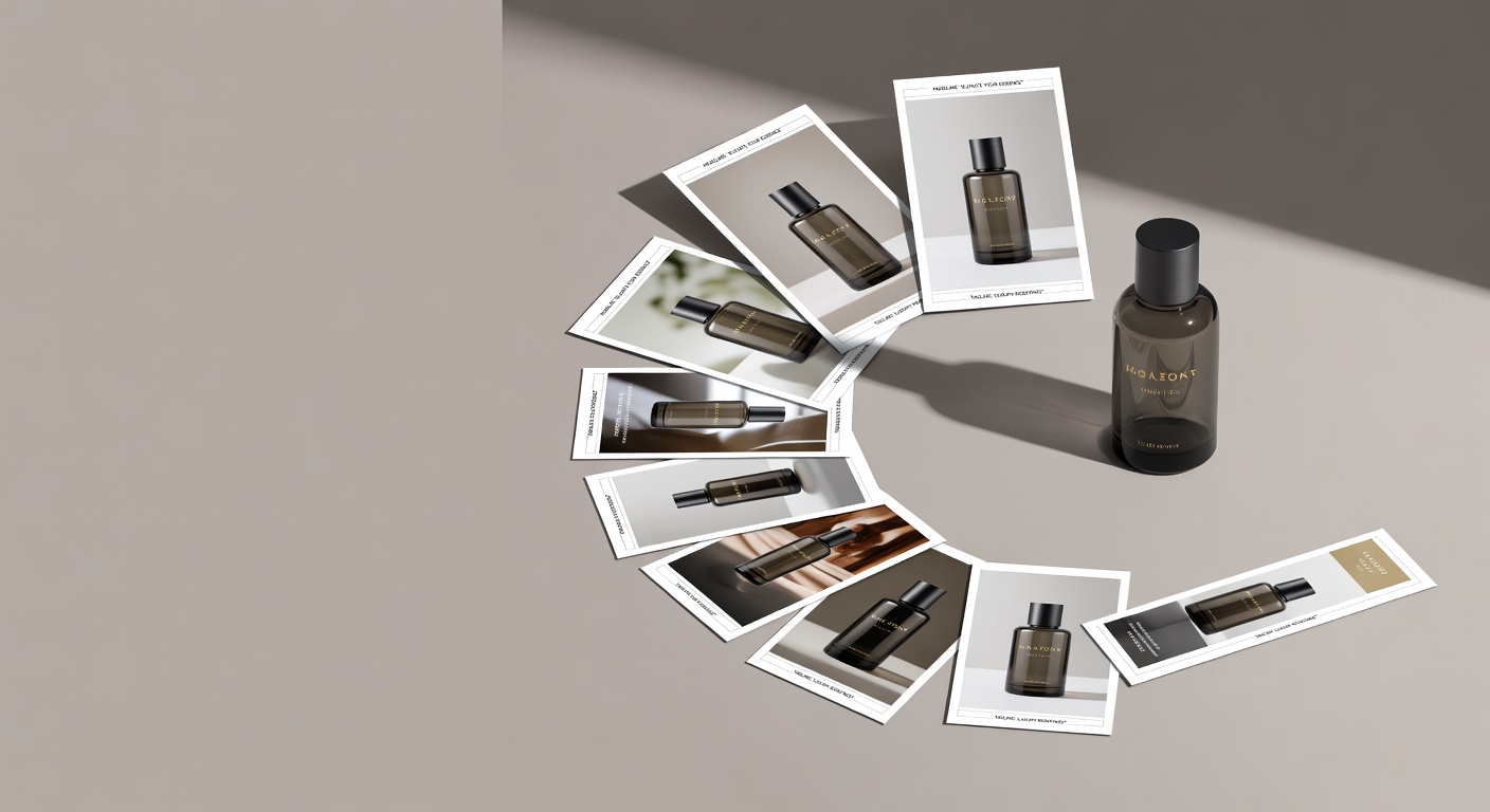
Worked example: same product, nine shots
The product: a stainless steel insulated water bottle, one studio photo on a gray gradient background.
- Cutout — background removed, white fill, submitted to Google Shopping feed.
- Lifestyle swap — placed on a wooden desk next to a laptop and open notebook. Targeted at remote-worker interest segments on Meta.
- Feature callout — arrows added: "Triple-wall vacuum" at the body, "Leak-proof lid" at the cap, "Fits standard cup holders" at the base. Ran in Meta feed against competitor retargeting audiences.
- Before / after — left side: a cracked, sweating single-wall bottle (stock photo, clearly generic). Right side: the product. Headline: "Still babying a bottle that doesn't keep anything cold?"
- UGC quote — pulled a real three-star-turned-five-star review: "Bought this skeptically. My coffee was still hot at 3pm. I don't know what to tell you." Product image appears bottom-right at 20% of frame size.
- Problem-first — full-frame image of a sweating plastic bottle leaving a ring on a wood table. Product appears at the bottom with a small badge: "No more rings. No more lukewarm."
- Urgency frame — same clean studio shot, red ribbon badge top-right: "Sale ends Sunday." Ran to cart-abandoners only.
- Comparison chart — three columns: This bottle / Cheap insulated / Single-wall. Five rows: keeps cold 24hr, BPA-free, fits cup holder, dishwasher-safe, warranty. Ran in Google Display against competitor search terms.
- Platform crops — every variant above re-exported at 1:1, 9:16, and 2:3.
Total variants from one studio photo: 9 templates × 3 ratios = 27 delivery-ready creatives. Copy time: roughly two hours. Background swap production using AI tools: fast enough that it is no longer the bottleneck — the bottleneck is now the strategic decisions, not the execution.
The G.E.M. lesson, ported to static
Television ad research — particularly work tracking how long individual spots ran before fatigue — showed a pattern that creative directors called G.E.M.: Generate, Exhaust, Mutate. You generate a concept, you exhaust its variations before retiring it, and you mutate the strongest version into the next concept.
Most digital ad buyers skip directly from Generate to Retire. They produce one creative, let it run until frequency kills it, then go back to production from scratch. That is expensive and slow.
The nine templates above are an operationalized version of Exhaust. They are not nine random ideas. They are nine structurally different ways to surface the same product to the same audience by changing the cognitive frame — problem, solution, social proof, urgency, comparison — without changing the underlying asset.
AI image tools are fast at two of these nine steps: background swap (template 2) and problem-first frame building (template 6). They are unreliable at anything requiring accurate text rendering, brand-safe typography, or precise multi-element composition. Use generation for context-setting. Use your design system for annotation, type, and compliance-sensitive elements. The tools that currently handle edge detection well enough for complex product shapes — jewelry, eyewear, products with handles — are Adobe Firefly inside Photoshop and PhotoRoom. Canva's AI background tool works for simple shapes. None of them are fire-and-forget for high-SKU catalogs.
When we ran structured template expansion against ad-hoc creative in accounts with constrained production budgets, accounts using structured variation held longer before frequency-driven CPM increases — because the algorithm had more distinct visual surface area to match against audience segments. More distinct visuals means more delivery options, which is cheaper for you. The math is not subtle.
For founders who can't staff a full creative team, these nine templates are the minimum viable creative infrastructure. They turn one good product photo into a real testing corpus — not by producing noise, but by producing variation that maps to real buyer psychology states.
Pick the two templates from the spec sheet that you don't currently run. Build them this week from what you already own.
FAQ
Can I really generate a full ad set from one product image? Yes, if you treat the image as a base asset rather than a finished creative. The nine templates in this post change the frame, context, copy layer, and format — not the photo itself. One clean, well-lit product image is sufficient raw material for 9–27 platform-ready creatives depending on how many format ratios you export.
What AI tools work best for generating background swaps from a product image? As of early 2026, the tools most commonly used for background replacement in ad production are Adobe Firefly (integrated into Photoshop), PhotoRoom, and Canva's AI background tool. Edge detection accuracy is the differentiating factor — it matters most for products with complex shapes like jewelry, eyewear, or anything with handles or cutouts. Firefly and PhotoRoom handle complex shapes more reliably. For simple bottles or boxes, all three work.
How many creative variants should I run per ad set? Our experience is that 4–6 structurally different templates — not 4–6 versions of the same template with copy changes — produce the best coverage across audience states without fragmenting your spend signal. Copy variants within a single template type are not the same as structural variation, and the algorithm treats them similarly because the visual hash is nearly identical.
Does changing only the background count as a new creative for platform algorithms? Yes, with an important caveat. A different background registers as a different creative for delivery and enters its own learning period. That is useful because each variant can find its own audience segment without being constrained by the prior variant's delivery history. The caveat: if the background change is minimal — a slight color shift on the same texture — the algorithm may not treat it as meaningfully distinct in practice. Make the context change real: different room, different surface, different lighting temperature.
Which of the nine templates works best for cold traffic? The before/after split frame and the UGC quote card consistently perform in cold traffic because they externalize the product claim. Instead of the brand asserting "this works," the format implies "someone else found this useful." For very cold audiences with no prior exposure to your product category, the problem-first frame often generates stronger initial engagement because it leads with recognition of the pain rather than resolution via the product.
Should I run all nine templates at the same time? No. Start with templates 1–6 for cold and mid-funnel audiences. Add templates 7 and 8 only when you have warm audiences large enough to generate statistically meaningful results. Running urgency creative to cold audiences wastes impression cost and trains the algorithm toward low-intent traffic. Run the comparison chart only when you have evidence your audience is actively comparing alternatives — typically mid-funnel, post-click-but-pre-purchase.
How do I know when a template is fatigued? Watch frequency-adjusted CTR, not raw CTR. When a creative's CTR falls while frequency is rising, that creative is fatiguing — the same people are seeing it and stopping less often. Pull it before CPM creep compounds the problem. The nine-template structure means you already have replacements staged. The goal is to rotate before performance falls, not after. That requires watching the frequency signal weekly, not monthly.
We build AdControlCenter — AI-powered ad management for anyone running their own ads. We write what we'd want to read: real numbers, no fluff, the things we wish we'd known when we started.
More from the team →Keep reading
All posts →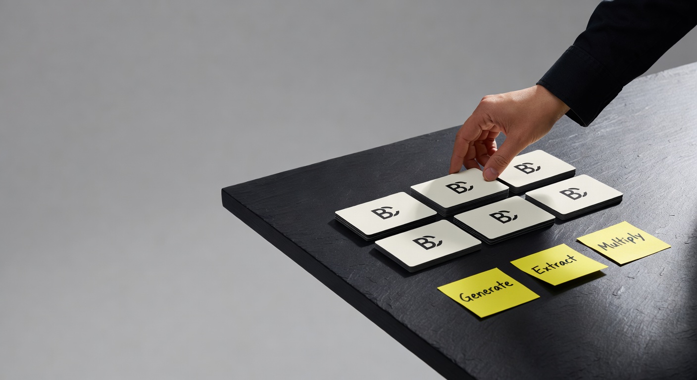
The G.E.M framework, but for static ads
The G.E.M framework was built for AI video—but its Generate / Extract / Multiply logic turns out to be exactly what broken static ad workflows need.
The evaluation framework that wins, not the model
Switching AI models gives you a marginal lift. Building a real evaluation loop gives you the compounding advantage.
Hands-on: building a logo overlay system that doesn't look fake
Most AI-placed logos look pasted on because they ignore what's already in the image — here's the two-step vision pipeline we built to fix that.