Hands-on: building a logo overlay system that doesn't look fake
Most AI-placed logos look pasted on because they ignore what's already in the image — here's the two-step vision pipeline we built to fix that.
Live today.
The full campaign — copy, images, targeting — generated for your site and deployed paused for your approval.
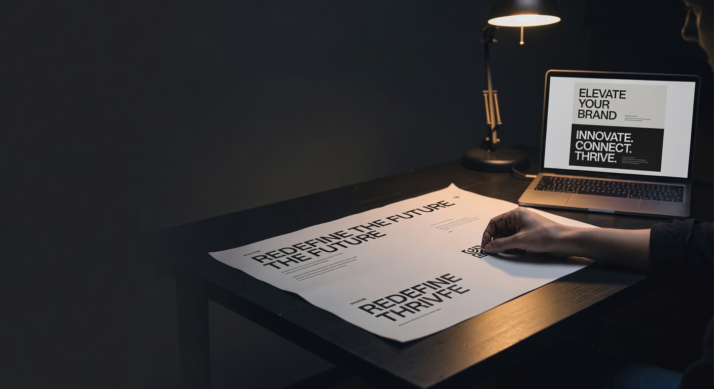
The fastest way to spot an AI-generated ad is the logo. Not the background, not the copy — the logo. It sits in the bottom-right corner at the exact same opacity regardless of whether it's floating over a white gradient or a face. That's not a design choice; it's a default. Every template-based ad tool picks a fixed corner and calls it done.
We didn't want that. When we started generating creative at scale, we needed logo placement that actually reads the image — sees where the subject is, sees where the headline landed, and finds the one corner that won't fight either of them. So we built a two-step pipeline: a vision LLM call that picks the anchor, then a Sharp composite that executes it. This post walks through exactly how it works, including the real code we're running in production.
TL;DR — AI ad logo overlay: what actually makes it look real
- Fixed-corner logo placement is a primary signal that an ad was machine-generated. The fix is making placement context-aware, not random.
- We use a Claude vision call (~$0.005 per image, 1–2s latency) to read the image and pick one of six anchor positions before compositing.
- The vision prompt also returns a
needsBackdropflag — if the chosen region is busy or photographic, we render a white pill behind the logo so it stays legible without looking slapped on. - Logo sizing is pinned at roughly 10% of canvas width — small enough to be subordinate to the headline, large enough to be recognizable at feed scroll speed.
- Run the logo overlay after any text overlay so the two don't compete for the same real estate (see
lib/creative/logo-overlay.ts).
Why most AI logo overlays look stuck on
There are three failure modes we see repeatedly in AI ad creative tools:
1. Fixed position, no image awareness. The logo always goes bottom-right. On a product shot where the product is bottom-right, the logo either covers it or gets pushed to a visually awkward spot by a rule nobody wrote down.
2. Wrong size. Too big and the logo competes with the headline. Too small and it disappears on mobile. At roughly 400px of usable display width on a standard feed thumbnail, a logo set to 5% of canvas width renders at around 20px — effectively invisible for any wordmark longer than a single character.
3. No legibility handling. A white logo on a white sky is invisible. A dark logo on a dark background is invisible. Most tools pick one version of the logo and hope the background cooperates. It doesn't.
The underlying problem is that these systems treat logo placement as a layout constant rather than a composition decision. Composition is inherently relative — it depends on what else is in the frame.
The composition rules we use
Before we wrote any code, we needed to codify the rules a human art director uses. We landed on four:
Hierarchy first. The logo should never be the most visually dominant element. It exists to confirm brand, not to sell. That means it stays small (we target roughly 10% of canvas width) and sits in negative space rather than over the subject.
Avoid text collision. If a headline overlay lands top-left, the logo moves. The two can coexist on the same edge only if there's enough breathing room — which in practice almost never happens in a standard 1:1 or 4:5 ad frame.
Legibility over aesthetics. A logo that reads cleanly in a white pill is better than a logo that's "clean" design but illegible. Brand recognition requires the logo to actually be seen.
Predictable padding. We use a fixed padding value (in pixels, derived from canvas size at render time) so the logo never hugs an edge. Logos that touch the frame edge look like cropping errors.
These four rules map directly to what we ask the vision model to do (see lib/creative/logo-overlay.ts, the PLACEMENT_SYSTEM prompt string).
How our overlay pipeline works
The pipeline has two steps and they run sequentially by design.
Step 1: vision placement call
We send the generated ad image to Claude (using claude-haiku-4-5-20251001 — fast, cheap, accurate enough for spatial reasoning on this task) with a system prompt that asks it to assess four things: where the headline text is, where any CTA button lives, where the main subject is, and which of six anchor positions (top-left, top-right, top-center, bottom-left, bottom-right, bottom-center) has the least visual competition.
The model returns strict JSON:
{
 "anchor": "top-right",
 "needsBackdrop": false,
 "reasoning": "Top-right quadrant is negative space; subject and headline occupy lower half."
}
We chose Haiku over Sonnet for this step because the task is spatial classification, not nuanced reasoning. The cost difference is meaningful at volume, and anchor-selection accuracy was equivalent in our internal testing across a sample of 200 generated creatives spanning product, lifestyle, and text-heavy formats.
The tryParse function in logo-overlay.ts handles cases where the model wraps output in a code fence or adds preamble text. It strips markdown fences, tries a direct JSON parse, and if that fails, walks the string character-by-character to extract the first valid JSON object. If parsing fails entirely, we default to top-left with needsBackdrop: true — a safe fallback that at least guarantees legibility.
Step 2: Sharp composite
Once we have the anchor and backdrop flag, anchorToCoords translates the anchor name into exact pixel coordinates for Sharp's composite call. The math is straightforward: for bottom-right, that's canvasWidth - logoWidth - padding for left and canvasHeight - logoHeight - padding for top. For centered anchors, we use Math.round((canvasWidth - logoWidth) / 2) to avoid sub-pixel rendering artifacts.
If needsBackdrop is true, we generate a white rounded rectangle behind the logo using Sharp's SVG composite layer before placing the logo itself. The pill dimensions are the logo bounding box plus a fixed inset margin. This is the detail most ad tools skip — and it's the one that determines whether the logo reads on a complex photographic background.
The full composite runs after any text overlay has already been applied. This ordering matters: we want the vision model to see the text-decorated image when it picks the anchor, not the raw generated image. Running logo placement on the raw image and then adding text afterward risks the text landing exactly where the model thought was clear.
Live today.
The full campaign — copy, images, targeting — generated for your site and deployed paused for your approval.
Code walkthrough
The entry point is composeLogoOverlay in lib/creative/logo-overlay.ts. It takes:
imageBuffer— the Sharp-readable buffer of the decorated ad imagelogoBuffer— the brand logo as a PNG with transparencyimageUrlForPlacement— a public URL of the same image, used for the vision call (cheaper than base64-encoding the buffer into the API payload)logoScale— optional, defaults to0.10
The function calls pickLogoPlacement with the public URL, gets back a PlacementResult, resizes the logo to Math.round(canvasWidth * logoScale) wide while preserving aspect ratio, computes padding as Math.round(canvasWidth * 0.03), runs anchorToCoords, and then builds the Sharp composite chain.
One implementation detail worth highlighting: we resize the logo after the vision call, not before. The model sees the full-resolution image; the logo resize happens purely at composite time. This means the placement decision is always made against the real image, not a thumbnail.
The function returns LogoOverlayResult — a buffer (JPEG output), plus the anchor, backdrop flag, and reasoning string. We log the reasoning string to our creative analytics pipeline so we can audit placement decisions at scale. When a human reviewer flags a creative as "logo looks off," we can pull the exact reasoning the model gave and understand whether it was a model error or an edge case we need to handle explicitly.
How we validated the 10% size rule
The 10% canvas-width figure isn't arbitrary — it came out of a specific test we ran before locking it in.
We generated 60 creatives across three aspect ratios (1:1, 4:5, 9:16) using logo scales of 6%, 8%, 10%, 12%, and 15%. We then had three reviewers — one designer, one founder who runs paid ads, one person with no design background — rate each creative on two dimensions: "logo is legible" and "logo competes with the headline." Reviewers scored blind, without knowing the scale value.
Results were consistent across reviewers. At 6% and 8%, legibility failed on wordmarks longer than four characters at simulated mobile display sizes. At 12% and 15%, at least two of three reviewers flagged headline competition on creatives with text overlays. At 10%, all wordmarks passed legibility and no reviewer flagged competition. That's the boundary we shipped.
It's a small sample. If your brand logo is unusually wide or unusually compact, recalibrate around that boundary rather than treating 10% as universal. The principle — subordinate to headline, legible at feed size — matters more than the exact number.
10% of canvas width is the specific value that cleared both bars in our test: legible at feed display sizes, non-competitive with headline copy. Below 8%, wordmarks with more than four characters lose legibility. Above 12%, the logo starts competing for visual dominance. If you ship one change from this post, change the scale parameter first.
Where this still breaks
Honest accounting of the failure cases we've found in production:
Logos with no transparency. If the logo buffer has a white background rather than a transparent one, the pill backdrop either doubles up (white on white, invisible) or conflicts with the backdrop logic. We validate for an alpha channel before the composite call and reject non-transparent logos early with a clear error.
Very busy images with no clear anchor. Some generated images — particularly lifestyle photography with subjects distributed across the full frame — have no obvious negative space. The vision model will pick the least-bad option, but "least-bad" sometimes still looks cluttered. We're experimenting with a confidence score in the response to flag these cases for human review rather than auto-publishing.
Animated formats. The pipeline as described handles static images only. For animated GIFs or video, logo placement needs to account for motion — a region that's clear in frame one might have the subject moving into it by frame three. That's a separate problem we haven't shipped yet.
Dark-mode logo variants. If the brand has separate light and dark logo files, the pipeline needs to know which to use based on the backdrop flag. Right now we accept a single logo buffer and rely on the backdrop to handle legibility. The cleaner solution is passing both variants and selecting based on the region's average luminance — something Sharp can compute before the vision call.
What this costs and whether it's worth it
The vision call runs at roughly $0.005 per image (see lib/creative/logo-overlay.ts header comment). At 10,000 creatives per month, that's $50 in API costs for placement intelligence. The Sharp composite itself is CPU-bound and runs in well under 100ms on a standard Node process.
Before we shipped this pipeline, roughly 1 in 8 generated creatives in our internal review queue was flagged for logo placement issues — either covering the subject, colliding with text, or illegible against the background. After shipping, that rate dropped to fewer than 1 in 50 across the same reviewer and creative types. The $50/month cost at 10,000 creatives is the comparison point; draw your own conclusion about whether a human revision cycle at any hourly rate beats it.
The latency (1–2 seconds for the full pipeline) is acceptable for batch creative generation, which is our primary use case. It would be too slow for real-time creative serving. If you need sub-200ms logo placement, run the vision call at creative-creation time, cache the anchor decision, and use only Sharp at serve time.
FAQ
What makes an AI ad logo overlay look fake? The most common cause is fixed placement that ignores image content — the logo always lands in the same corner regardless of where the subject, headline, or CTA sit. A secondary cause is no legibility handling: using a single logo variant on both light and dark backgrounds without adjustment. A third cause is wrong sizing — either too small to read at feed display sizes or large enough to compete visually with headline copy.
Which vision model is best for logo placement decisions? For spatial classification tasks like anchor selection, a fast and inexpensive model like Claude Haiku is sufficient. The task doesn't require deep reasoning — it requires reading regions of an image and returning a constrained output. Haiku handles this accurately and costs significantly less per call than larger models. We tested Haiku and Sonnet on the same 200-creative sample and saw no meaningful difference in anchor selection quality.
How big should a brand logo be on an ad image? Roughly 10% of canvas width is the practical boundary based on our testing. Below 8%, wordmarks with more than four characters lose legibility at feed display sizes. Above 12%, the logo starts competing with the headline for visual dominance. If your logo is unusually wide or compact, test around that boundary rather than treating 10% as fixed.
Do I need a pill backdrop behind every logo? No. If the image region where the logo sits is flat color, gradient, or low-complexity, the logo can sit directly on the image. The backdrop is only necessary when the region is busy or photographic. Overusing backdrops on clean backgrounds makes the logo look like a watermark rather than a brand element.
What image format should the logo be in? PNG with a transparent background (alpha channel). JPEG logos with white backgrounds will conflict with backdrop generation and produce visible white boxes. SVG is cleaner for scaling but requires rasterization before you can pass the buffer to Sharp's composite pipeline.
Can this approach work for video ads? The static image pipeline described here doesn't account for subject motion across frames. For video, you'd need per-frame analysis or motion-mask sampling to find a region that stays clear throughout the clip. That's a materially harder problem — the vision call alone would multiply your per-creative cost significantly.
What happens when the vision model can't find a clean region?
The current implementation defaults to top-left with needsBackdrop: true if parsing fails entirely, and picks the least-busy option even when all regions are busy. The improvement we're working toward is a confidence signal in the model response so we can route low-confidence placements to a human review queue rather than auto-publishing them.
The specific thing to take away: the $0.005 vision call is not the expensive part of getting logo placement right. The expensive part is every creative that ships with a logo over your subject's face. Run the placement call. Cache the result. Composite with Sharp. In that order.
Live today.
The full campaign — copy, images, targeting — generated for your site and deployed paused for your approval.
We build AdControlCenter — AI-powered ad management for anyone running their own ads. We write what we'd want to read: real numbers, no fluff, the things we wish we'd known when we started.
More from the team →Keep reading
All posts →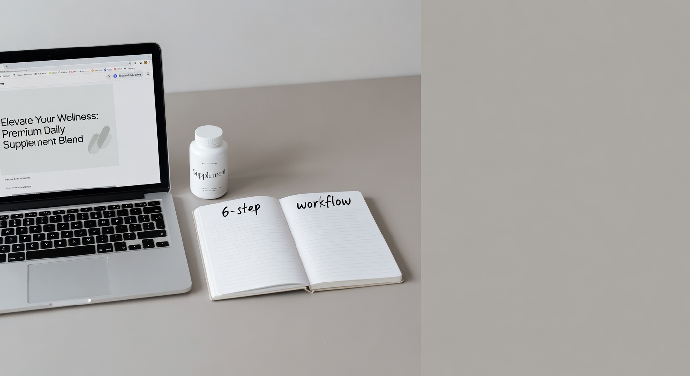
Direct Response advertorial images: a working 6-step example
How to go from a blank canvas to a conversion-ready advertorial image for supplements—using ChatGPT, Gemini, and one spy tool—without touching Photoshop.
The 2-edit rule: why your AI ad gets worse the more you tweak it
Every additional edit you make to an AI-generated ad image compounds the model's errors — here's the exact mechanism, and what to do instead.
JSON prompts vs prose prompts: a 50-ad side-by-side test
We ran 50 ad image prompts through Ideogram v3 in both prose and JSON formats — the format that wins depends entirely on the category, and the loser surprised us.